Key takeaways
- Web accessibility means people with disabilities can perceive, operate and understand your site. It also helps everyone on small screens, in bright light or without a mouse.
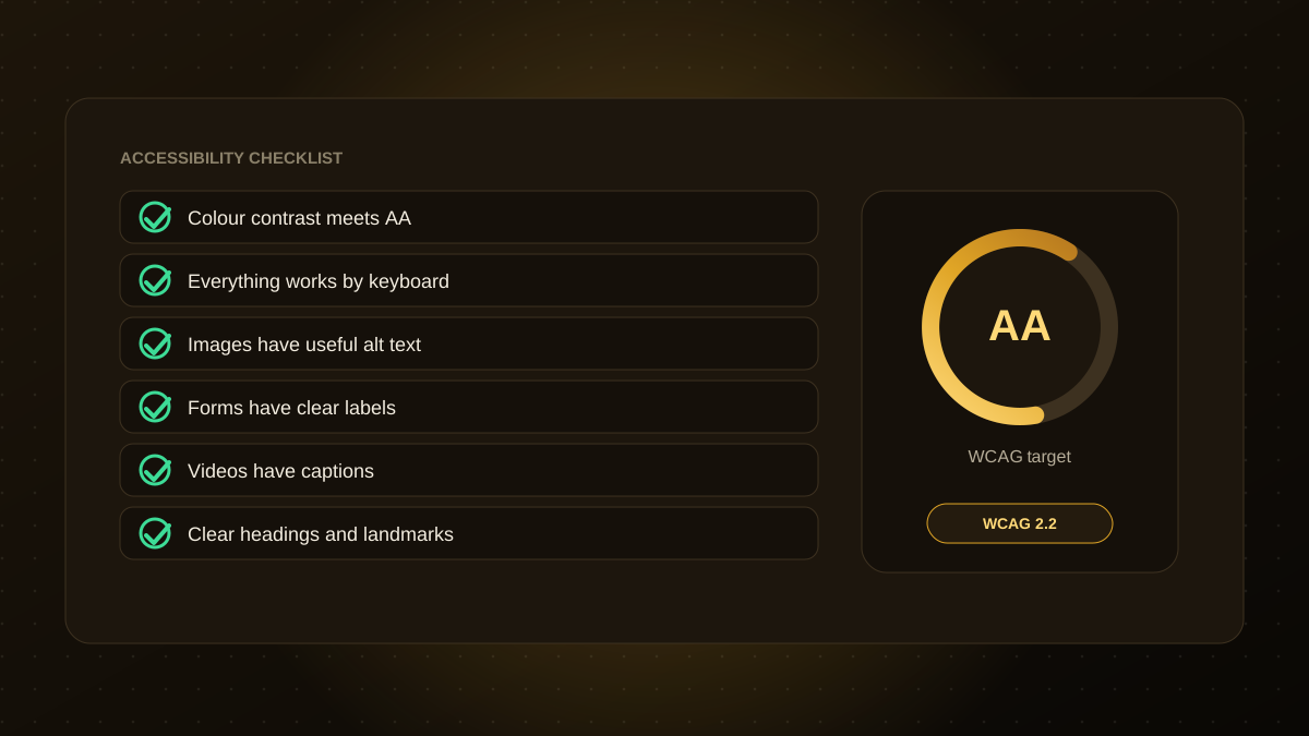
- WCAG is the widely used technical guideline. Level AA is the common target.
- The European Accessibility Act has applied since June 28, 2025 to certain products and services, including consumer e-commerce, with a limited exemption for micro-enterprises.
- Many fixes are simple: contrast, labels, headings, keyboard focus and alt text.
- Combine automated checks with manual testing, and publish an accessibility statement.
Why accessibility matters
Around one in six people lives with a disability, and many more have temporary or situational limits, such as a broken arm or a glaring screen. An accessible site is easier for all of them, tends to be better structured for search engines and reduces the risk of complaints and legal action. It is good design, not an optional extra.
What the law says, in brief
In the European Union, the European Accessibility Act (Directive (EU) 2019/882) has applied since June 28, 2025. It covers certain products and services, including consumer e-commerce, and is implemented through national laws. Micro-enterprises providing services, those with fewer than 10 staff and limited turnover or balance sheet, are generally exempt, though the details vary by country and by whether you sell products or services. The technical benchmark is usually EN 301 549, which refers to WCAG 2.1 Level AA, and the status of newer versions is still being clarified. Many teams aim for WCAG 2.2 AA.
This is a summary, not legal advice. Check the directive and your national law, or ask a specialist, to find out how it applies to you.
The checklist
- Colour contrast. Text should meet at least 4.5:1 against its background (3:1 for large text).
- Keyboard access. Every link, button, menu and form works without a mouse, with a visible focus outline.
- Alt text. Meaningful images have useful descriptions, and decorative ones are marked to be skipped.
- Headings and landmarks. One main heading, a logical order below it and clear page regions.
- Form labels and errors. Every field has a visible label, and error messages say what went wrong and how to fix it.
- Link text. Use descriptive links such as "Read our pricing guide", not "click here".
- Captions and transcripts for video and audio.
- No reliance on colour alone to convey meaning, such as red for errors.
- Resizable text and responsive layout that works at 200% zoom and on small screens.
- Motion and timing. Respect reduced-motion settings and avoid auto-playing media or time limits that cannot be extended.
- Language and page titles set correctly.
- Accessible names for custom components such as menus, tabs and dialogs.
How to test
- Automated tools catch roughly a third to a half of issues, such as missing alt text and low contrast.
- Keyboard-only run. Try to complete your key journeys without a mouse.
- Screen reader checks on key pages with a common screen reader.
- Zoom and mobile checks.
- Real users. Feedback from people with disabilities is the most valuable test.
Make it part of the process
Fixing accessibility after launch is slower and costlier than designing for it. Build it into design systems, code reviews and your redesign checklist. Publish an accessibility statement that explains your standard, known gaps and how to report problems. Well-structured accessible pages also tend to perform better in AI search. If you want an accessibility review of your site, our website development team can audit it and prioritise fixes.

Qodexify is a remote-first team of senior engineers building web apps, AI agents, workflow automation and websites. Learn more about our website development service or talk to an engineer.